Davi Soares - Branding
brand guideline
ProjectFact sheet
- Role
- Brand identity, brand guideline and website
- Period
- 2022 – 2026
- Deliverables
- Monogram, signature, brand guideline, website and design system
- Tools
- Illustrator and Photoshop for the brand; for the design system:ReactTypeScript
Concept
The concept of the visual identity comes from a movement from sophistication towards simplicity, in a clear and direct way, using the letters of the professional's first name, stylized and overlapped.
The goal of the logo is to be a contemporary and pleasant logotype.
- official colors
- 4
- typefaces
- 2
- pieces in the monogram
- 6
- the axis of every diagonal
- 45°
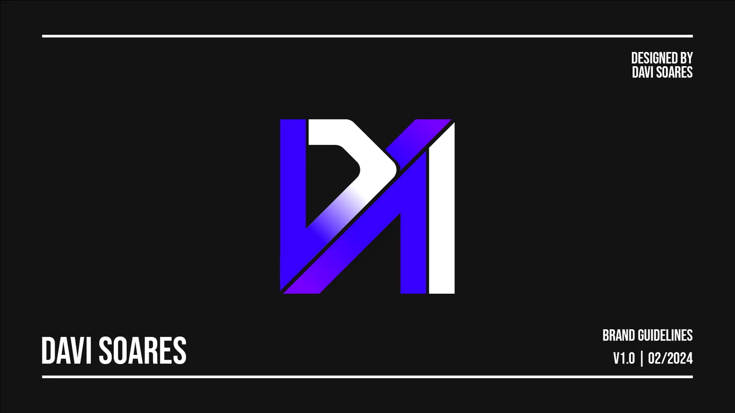
Logos
As a rule, the 1:1 logo is the one in use: in profile pictures, in website footers and in professional settings.
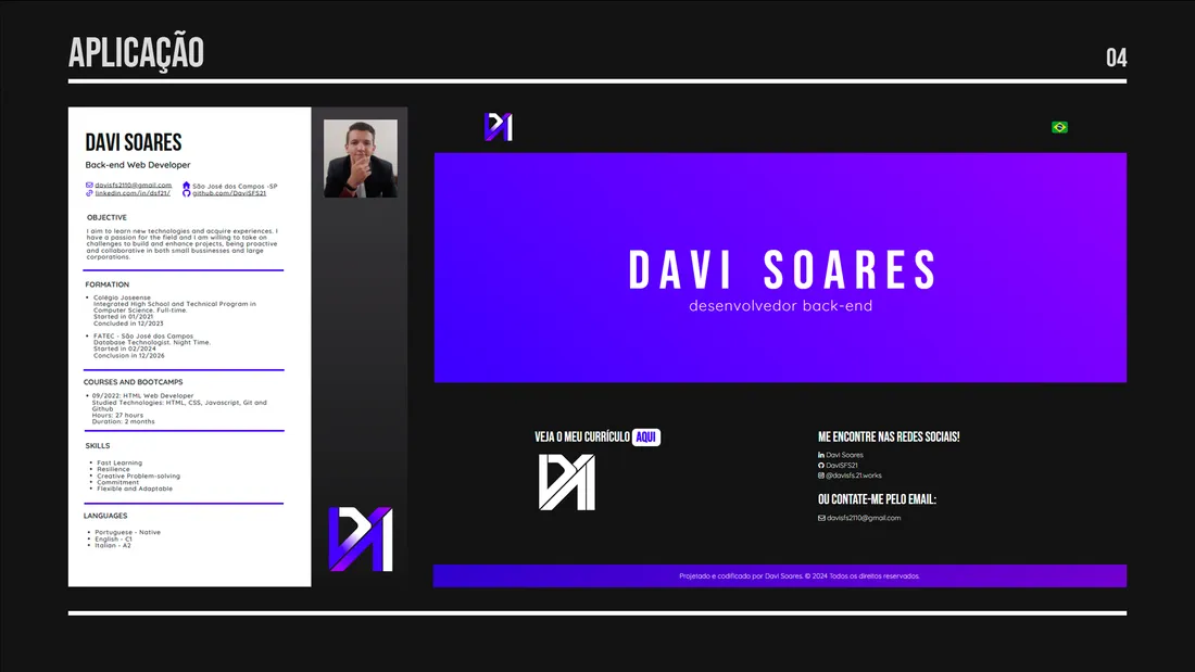
The horizontal variation can be used in textures or as an artistic resource. At the top of the new website, it takes the place of the name.


Usage and application
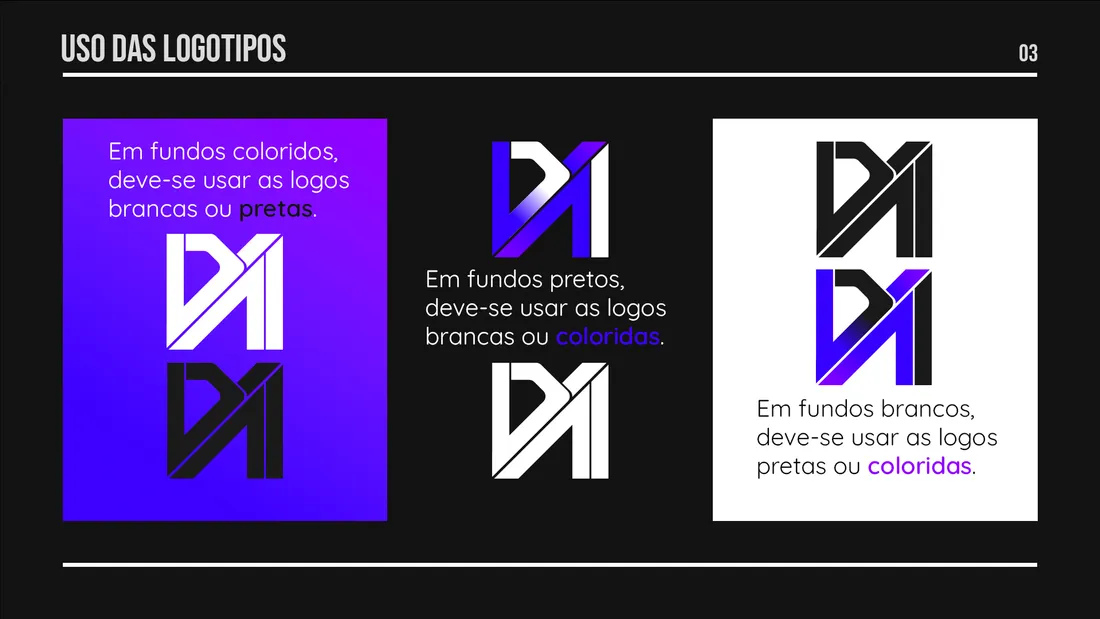
On colored backgrounds, white or black logos. On black backgrounds, white or color ones. On white backgrounds, black or color ones.
Motion
In 2026 the brand started to move. The logo builds itself like a project: first the guide lines, then the outlines and, at last, the color coming in at 45°.
Taking it apart follows the same path, in the same direction: the color drains, the stroke pulls back and the guides move away.